
Misleading graphs and charts distort data through visual tricks that manipulate your perception. By adjusting axes, scales, or using confusing elements, you might see exaggerated trends or understated differences that aren’t accurate. Bright colors, partial labels, or distorted shapes can also steer your interpretation without you realizing. Recognizing these design choices helps you spot bias and understand true data better. Keep exploring, and you’ll discover how to identify common strategies and protect yourself from deceptive visuals.
Key Takeaways
- Manipulating axes and scales can exaggerate or minimize data differences, misleading viewers about trends or significance.
- Using disproportionate shapes, inconsistent bar lengths, or pie slices distorts the true proportions of data.
- Employing bright colors or emphasizing labels directs attention selectively, skewing interpretation of the overall data.
- Truncating axes or starting scales above zero creates false impressions of rapid growth or decline.
- Recognizing common design tricks helps critically evaluate graphs for honesty and accuracy in data presentation.

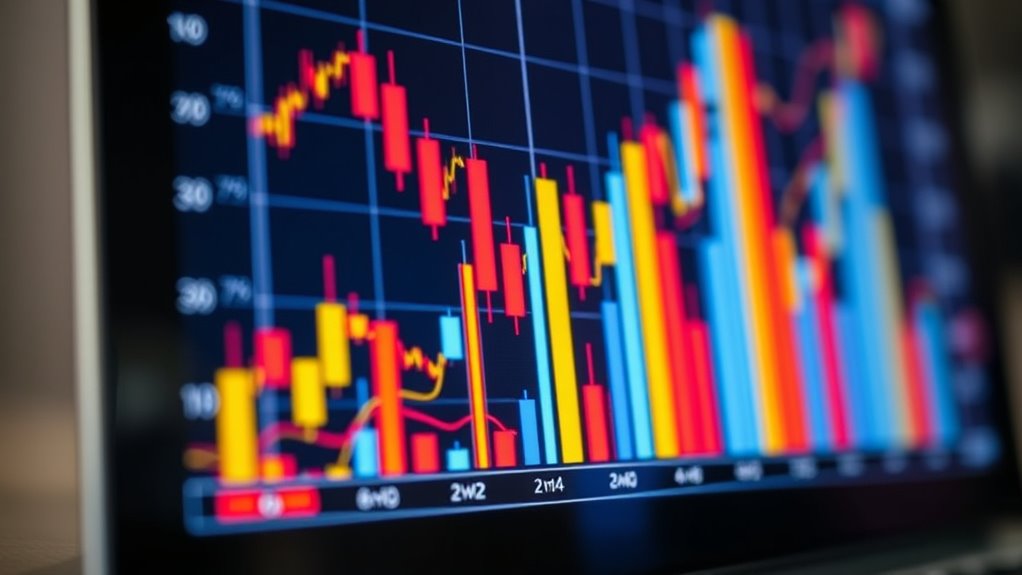
Graphs and charts are powerful tools for visualizing data, but they can also be deceiving if not designed carefully. The way you approach graph design directly impacts how viewers interpret the information. Poorly crafted graphs can introduce data distortion, leading audiences to draw false conclusions. For example, manipulating the scale of axes or choosing specific intervals can exaggerate or minimize differences between data sets. This subtle adjustment can make small changes seem significant or large differences appear trivial, skewing perception without outright lying. Recognizing these design choices is key to understanding whether a graph honestly represents the data or intentionally misleads.
Poorly designed graphs distort data, leading to false conclusions and misleading perceptions.
When designing a graph, you might be tempted to alter the axes to emphasize a particular trend. For instance, truncating the y-axis or starting it at a value other than zero can make fluctuations appear more dramatic than they truly are. This form of data distortion can create an illusion of rapid growth or decline, influencing viewers’ emotions and opinions. It’s a common tactic used in marketing, politics, and media to sway public perception. By paying close attention to how axes are scaled and labeled, you can spot these tricks. A well-designed graph maintains a consistent scale and avoids unnecessary manipulations, offering an honest view of the data.
Another aspect of graph design that can contribute to data distortion is the choice of visualization type. Using a pie chart with too many slices or a bar graph with uneven bars can confuse or mislead viewers. The shape and size of visual elements should accurately reflect the data they represent. When visual elements are manipulated—such as stretching bars beyond their proportional values—it distorts the viewer’s understanding. This misrepresentation can lead to overestimating or underestimating the importance of certain data points. As a reader, it’s essential to critically assess whether the visual elements align logically with the underlying numbers.
Color choices and labeling also play roles in how data is perceived. Bright or contrasting colors might draw attention to specific parts of a chart, potentially emphasizing certain data while downplaying others. Inaccurate or unclear labels can further distort the message, making it difficult to interpret the data accurately. Effective graph design uses color and labels thoughtfully, ensuring the viewer receives an honest, straightforward presentation of the data. Additionally, understanding the visualization type can help identify whether the graph’s design appropriately communicates the data or introduces bias.
Ultimately, understanding the principles of good graph design helps you recognize when data distortion is at play. Whether you’re creating visuals or simply analyzing them, being aware of common manipulation tactics empowers you to see through misleading representations. Accurate, honest graphs respect the data and serve their true purpose: to inform, not deceive.
Frequently Asked Questions
How Can I Identify Manipulated Graphs in News Articles?
To identify manipulated graphs in news articles, look for graph red flags like inconsistent scales, cherry-picked data, or distorted axes. Check if the chart’s visual elements exaggerate or minimize differences, affecting chart credibility. Be wary of missing context or selective data points. By scrutinizing these signs, you can spot misleading visuals and better assess the true story behind the data presented.
What Are Common Techniques Used to Distort Data Visually?
You should watch for common techniques like graph distortions, where axes are manipulated to exaggerate or downplay data trends, and visual deception, such as truncated y-axes or inconsistent scales that mislead your perception. Be cautious of cherry-picking data points or using misleading colors. These tactics distort the true story, making you believe an outcome is more significant or less important than it really is. Always verify with raw data when possible.
Are There Tools to Detect Misleading Charts Automatically?
Think of automated detection tools as your digital detective, uncovering misleading charts like a bloodhound on a scent. Yes, there are tools that utilize visual forensics to automatically spot distortions in graphs and charts. These tools analyze visual cues, scales, and data representation to flag anomalies. They’re invaluable for ensuring data integrity, helping you see through deceptive visuals, and keeping your analysis honest and trustworthy without needing to be a forensic expert yourself.
How Do Misleading Graphs Influence Public Opinion?
Misleading graphs profoundly influence your public opinion by triggering psychological impacts and exploiting cognitive biases. They can distort facts, making you believe false narratives or exaggerate differences. When you see manipulated visuals, your subconscious biases may lead you to accept misleading information without questioning it. This manipulation shapes perceptions, sways decisions, and can undermine trust in credible data, ultimately controlling what you think about important issues.
What Ethical Guidelines Exist for Responsible Data Visualization?
You might think ethical standards are just fancy rules, but they actually safeguard visualization integrity. Responsible data visualization requires honesty, transparency, and clarity, ensuring your graphs don’t deceive. Following these guidelines helps you build trust and avoid misleading your audience—irony at its finest! By adhering to ethical standards, you protect viewers from manipulation and keep your data truthful, making your insights both compelling and trustworthy.
Conclusion
You now see how easily graphs and charts can deceive you, turning simple data into a web of lies. Don’t fall for every colorful curve or misleading axis—you’re smarter than that. Recognize the tricks, question what’s presented, and protect yourself from being duped. Remember, these visual illusions can hide truths or amplify falsehoods so convincingly that you might wonder if reality itself has been manipulated. Stay vigilant—you’re more powerful than any misleading graphic.