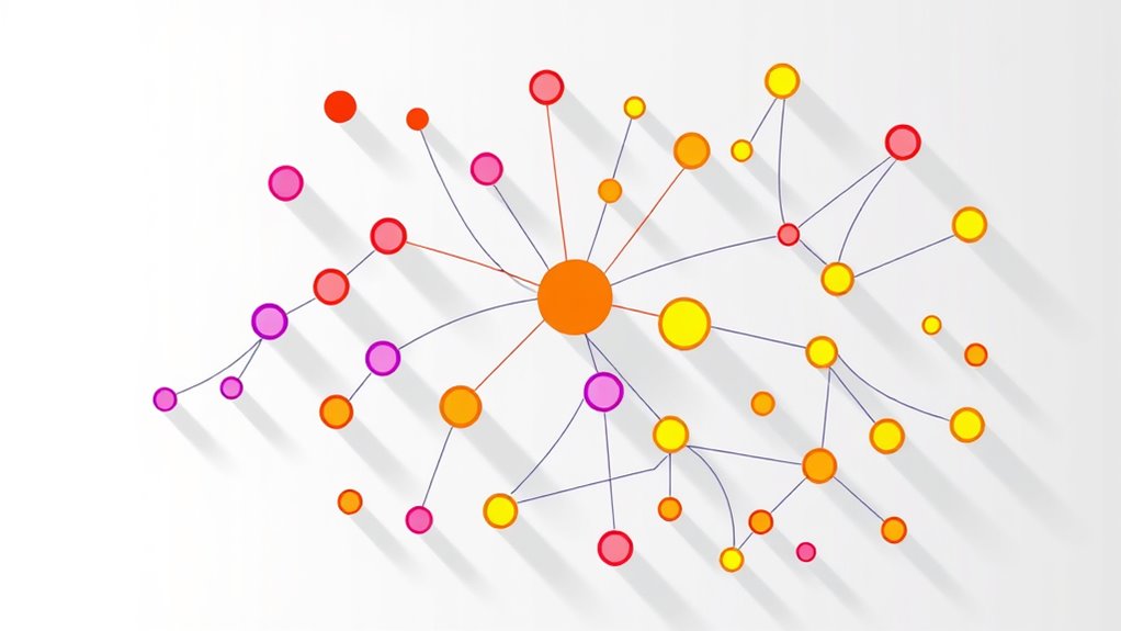

A relationship map diagram visually shows roles and influence among stakeholders, helping you identify key players and understand their connections. It highlights how individuals or groups collaborate, influence decisions, or depend on each other. With this tool, you can spot communication gaps, potential conflicts, and influence concentrations. Using it strategically enables you to tailor engagement and improve relationships. Keep exploring to discover how this visual approach can strengthen your stakeholder management and project success.
Key Takeaways
- Clearly define all stakeholders, roles, and influence levels to structure the map effectively.
- Use visual cues like line thickness or color to represent relationship strength and influence.
- Identify key influencers and their communication pathways to optimize engagement strategies.
- Detect weak or disconnected links indicating potential conflict points or communication gaps.
- Continuously update the map to reflect evolving relationships and influence dynamics within the system.
A Relationship Map Diagram is a visual tool that helps you clearly understand and analyze the connections between different entities, concepts, or individuals. It provides a clear overview of how various stakeholders relate to each other within a system, project, or organization. By mapping out these relationships, you can identify key players, understand their roles, and assess their influence. This clarity is essential for effective stakeholder analysis, which involves pinpointing who has the power, interest, or potential impact on your objectives. A well-constructed relationship map allows you to see not just who the stakeholders are but also how they interact, where communication pathways exist, and where gaps or bottlenecks may occur. It’s a strategic tool that reveals the flow of information, decision-making authority, and influence dynamics, helping you design better engagement strategies.
When creating a relationship map diagram, you start by identifying all relevant entities—individuals, groups, departments, or external organizations. Once these are listed, you establish the connections between them, illustrating relationships such as collaboration, influence, or dependency. These connections often come with varying strengths or significance levels, which you can depict through different line thicknesses or colors. This visual differentiation helps you quickly grasp which relationships are most critical and where influence is concentrated. Understanding these dynamics enables you to prioritize your communication pathways effectively, ensuring that information flows through the most impactful channels. For example, if you notice a stakeholder who holds significant influence but has limited communication pathways, you can focus on strengthening those channels to ensure their involvement is optimized. Conversely, if a key stakeholder is over-reliant on a single communication pathway, you can diversify channels to prevent bottlenecks or miscommunication.
A relationship map diagram also highlights potential areas of conflict or misalignment. If two influential stakeholders are disconnected or have weak links, it could signal potential friction points or communication breakdowns. Recognizing these early allows you to proactively manage relationships, facilitate better communication, and align interests. The diagram acts as a strategic blueprint, guiding you on how to navigate complex stakeholder landscapes and influence networks. As a result, you gain a clearer understanding of who to engage with directly, how to tailor your messaging, and which relationships to nurture for project success. Additionally, understanding local tips and city dynamics can enhance your engagement strategies. Ultimately, a relationship map diagram is not just a static visualization but a dynamic tool that helps you adapt your approach as relationships evolve, keeping you well-informed about the roles and influence of everyone involved.
Frequently Asked Questions
How Can I Customize a Relationship Map Diagram for My Team?
To customize a relationship map diagram for your team, start by analyzing your team dynamics and conducting a stakeholder analysis. Identify key roles, influence levels, and relationships. Use colors, symbols, or different line styles to highlight these aspects. Adjust the layout to emphasize important connections, and regularly update the map as team roles or influence levels change. This tailored approach helps visualize how everyone interacts and influences project success.
What Tools Are Best for Creating Relationship Map Diagrams?
Think of creating your relationship map like planting a garden—tools like Miro, Lucidchart, and Canva are your versatile shovels and watering cans. These tools excel at visual mapping and influence analysis, helping you visualize team dynamics clearly. I once used Miro to map out stakeholder influence, making complex relationships simple to grasp. Choose one based on ease of use and collaboration features, and watch your team’s understanding grow.
How Do I Interpret Conflicting Influences in a Relationship Map?
When you encounter conflicting signals in a relationship map, you should analyze the influence balancing between the roles. Look at the strength and direction of each influence, noting where signals oppose or reinforce each other. Consider the context and the stakeholders involved, then adjust your understanding accordingly. This helps you interpret conflicting influences clearly, allowing you to develop strategies that address the most impactful relationships effectively.
Can Relationship Maps Be Used for Conflict Resolution?
Research shows that 70% of effective conflict resolution strategies involve clear visualization of relationships. You can definitely use relationship maps for conflict visualization, helping you see relationship dynamics clearly. By mapping out roles and influence, you identify sources of tension and understand different perspectives. This approach promotes empathy, facilitates communication, and guides you toward collaborative solutions, making conflict resolution more strategic and less emotional.
What Are Common Mistakes to Avoid When Designing a Relationship Map?
You should avoid common pitfalls like oversimplifying relationships or ignoring influence dynamics when designing a relationship map. Don’t overlook key roles or misrepresent the strength of connections, as these design errors can lead to inaccurate insights. Steer clear of cluttered layouts and vague labels, which make the map confusing. Instead, focus on clarity and precision to guarantee your map accurately reflects the real-world interactions and influence levels among stakeholders.
Conclusion
By mastering the relationship map diagram, you open a powerful tool that can transform your understanding of roles and influence—it’s like holding the secret code to a universe of connections. With this knowledge, you’ll navigate complex networks effortlessly, making every interaction count. Don’t underestimate its potential; it’s your ultimate weapon to dominate any social or professional landscape. Embrace it, and watch your influence skyrocket beyond what you ever thought possible!